Visualizing Geodata using Python

Visualizing data is one of the most fun parts of studying it. This blog is an introduction to plotting and visualizing geo data using Python.
What is Geodata
Geodata, short for geographic data, refers to information that is associated with a specific location on the Earth's surface. It includes various types of data that are linked to spatial coordinates, such as latitude and longitude, and even temporal coordinates like time. Geodata can provide details about physical features, landmarks, boundaries, transportation networks, weather patterns, population density, etc.
It is stored in various forms like Raster, Vector, Binary, Swath, etc. These are stored in multiple file formats. Some file formats are NetCDF, Grib, Tiff, Zarr, HDF5, Burf. These files are what is called a dataset, i.e. they contain all the related weather data as a collection.
Data is collected from various sources. There are primary data sources such as GPS, surveys, aerial photographs, and remote sensing images. There are also secondary data sources like scanned maps, elevation models, topographic surveys, etc.
A lot of geodata can be accessed free of cost on various websites. Organizations upload these datasets for academic and research purposes.
Here are a few of the organizations:
For the purpose of this tutorial, we are going to use this dataset but similar steps can be followed for other datasets too. https://psl.noaa.gov/data/gridded/data.ncep.reanalysis.html (open data)
Opening geodata using Python
Geodata is present in many formats but we need a unified way to read such data. Xarray is an open-source tool that enables us to open and load such files into Python.
It can be installed by running
pip install xarray
First, we import Xarray
import xarray as xr
file_name = "/path/to/downloaded/file/*.nc"
Next, let's open the dataset and view its contents
ds = xr.tutorial.open_dataset("air_temperature")
print(ds)

output:

<xarray.Dataset>
Dimensions: (lat: 73, lon: 144, level: 17, time: 1460, nbnds: 2) Coordinates:
* lat (lat) float32 90.0 87.5 85.0 82.5 ... -85.0 -87.5 -90.0
* lon (lon) float32 0.0 2.5 5.0 7.5 ... 352.5 355.0 357.5
* level (level) float32 1e+03 925.0 850.0 ... 30.0 20.0 10.0
* time (time) object 0001-01-01 00:00:00 ... 0001-12-31 18:0...
Dimensions without coordinates: nbnds
Data variables:
climatology_bounds (time, nbnds) datetime64[ns] ...
air (time, level, lat, lon) float32 ...
valid_yr_count (time, level, lat, lon) float32 ...
Attributes:
Conventions: COARDS
description: Data is from NMC initialized reanalysis\n...
platform: Model
not_missing_threshold_percent: minimum 3% values input to have non-missi...
history: Created 2011/06/29 by do4XdayLTM\nConvert...
title: 4X daily ltm air from the NCEP Reanalysis
dataset_title: NCEP-NCAR Reanalysis 1
References: http://www.psl.noaa.gov/data/gridded/data...
Let's go through it one by one
- Dimensions are the shape of your name where the size of each coordinate is mentioned.
- Coordinates are like indexes. You can index data by specifying each coordinate.
- Data variables are where the actual data is stored. Data variables need not have all the coordinates as indexes. Each data variable is a xarray DataArray.
- Attributes are the metadata you get like geo information, description, source, etc.
You can see the Data variables by just indexing them using its name
print(ds['air'])

output:

<xarray.DataArray 'air' (time: 1460, level: 17, lat: 73, lon: 144)>
[260907840 values with dtype=float32]
Coordinates:
  * lat      (lat) float32 90.0 87.5 85.0 82.5 80.0 ... -82.5 -85.0 -87.5 -90.0
  * lon      (lon) float32 0.0 2.5 5.0 7.5 10.0 ... 350.0 352.5 355.0 357.5
  * level    (level) float32 1e+03 925.0 850.0 700.0 ... 50.0 30.0 20.0 10.0
  * time     (time) object 0001-01-01 00:00:00 ... 0001-12-31 18:00:00
Attributes:
    long_name:     Long Term Mean 4xDaily Air temperature
    units:         degK
    precision:     2
    GRIB_id:       11
    GRIB_name:     TMP
    var_desc:      Air temperature
Great now that we have the data, we are ready to plot this.
Plotting the data using matplotlib
We are going to use matplotlib basemap toolkit for plotting data. This helps us in plotting latitude and longitude based data easily on a plot while also providing different projections and outlines for coastlines and countries.
It can be installed using pip.
pip install basemap
Import the necessary libraries
import matplotlib.pyplot as plt
from mpl_toolkits.basemap import Basemap
Get all the necessary data
air_data = ds['air'].isel(time=0, level=0)
lats = ds['lat']
lons = ds['lon']
Plot the data using Basemap
# Create base map object with projection and other params
map = Basemap(projection='mill', llcrnrlon=lons.min(), llcrnrlat=lats.min(), urcrnrlon=lons.max(), urcrnrlat=lats.max())


# Add map features
map.drawcoastlines()
map.drawcountries()


# Create mesh grid of lons and lats
lon_mesh, lat_mesh = np.meshgrid(lons, lats)
x, y = map(lon_mesh, lat_mesh)


# Plot the data
plt.figure(figsize=(10, 8))
map.pcolormesh(x, y, air_data, cmap='jet')


# Add colorbar
plt.colorbar(orientation='horizontal', label="Air temperature (units: degK)", fraction=0.046, pad=0.04)


# Show the plot
plt.title("4X daily ltm air from the NCEP Reanalysis")
plt.show()
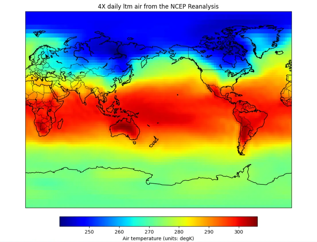
Looks awesome!
But we can do more, we can view this data in different projections by changing the projection parameter when creating Basemap object. More projections can be found at basemap docs.
Using hammer projection
map = Basemap(projection='hammer', lon_0 = 0)
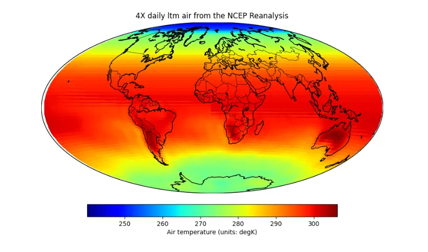
That's it folks, it's that easy to plot geodata in python.